


Icon graphics are so ubiquitous that we often take them for granted. Used correctly, however, they can be vehicles for branding that’s nothing short of, well, iconic.
From traffic signs to computer keyboards, icons bring order to our lives on a daily basis. With tasteful design and intuitive representation, they help us enhance content and make user experiences more enjoyable by creating a curated visual environment.
Although many icon graphics may seem simple, that straightforwardness is actually the end-product of careful design. For brands looking to make their mark on the user experience, icon graphics can do a lot of legwork when it comes to crafting a compelling and unified website, app, or piece of collateral.
The Beginning of Icon Graphics
Apple has always had a penchant for design, so it makes sense that one of the earliest and most influential collections of digital icons could be found on first generation Mac computers. Compared with the complicated user interfaces of earlier platforms, Apple’s icons (below) simplified written language and reinforced key concepts of action and information.
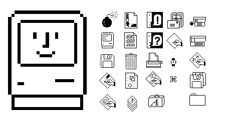
Although these pixelated icons were restricted by grid-based graphic interfaces, they created a more approachable computing experience for the average consumer. By reducing the space needed to explain what a desktop application effectively did, these icons also paved the way for the instantly recognizable mobile icons of today’s smartphones.
The Branding Potential of Icon Graphics
While one might describe an icon as a symbol of sorts, these two terms are not strictly interchangeable. Symbols are visual marks or signs that have culturally assigned meanings: think ampersands or hashtags. While on their own, they are meaningless, they are assigned significance by what we learn to associate with them. On the other hand, icons depict something of what they represent. Think of the trash icon on your computer or a sign guiding you to the restroom.
For businesses, icons present an opportunity to combine this level of utility with brand recognition. At the end of the day, icons, whether they’re on your e-commerce platform or in your business’s white paper, need to efficiently convey what it is that they represent. However, that doesn’t mean that they can’t also become branded experiences in and of themselves. After all, you’d be hard-pressed to find someone who couldn’t easily recognize Facebook’s thumbs up icon as a “like.”
Take the below icons from LEGOⓇ’s online store as an example. By charmingly depicting what each icon will allow a user to do — from subscribing to LEGOⓇ emails to interacting with other brand enthusiasts — with the playfulness that we know and love from the LEGOⓇ brand, these visuals help customers complete tasks while promoting the brand in the process.

The Styles of Icon Graphics
Icons have come a long, long way since the days of their over-pixelated forebears. For brands looking to add unique character to their icon inventory, there are plenty of styles to choose from. From flat-designed and mixed-depth to single-line and two-tone options, here’s a peek at some of my favorite iterations.
Flat Design

Icons with a flat design boast a playful, merit-badge-styled charm. By mixing complementary colors with a simple yet informative design, these icons offer a bit of fun while guiding users toward their needs. For brands looking to project a youthful energy that still maintains a professional edge, flat designs are ideal.
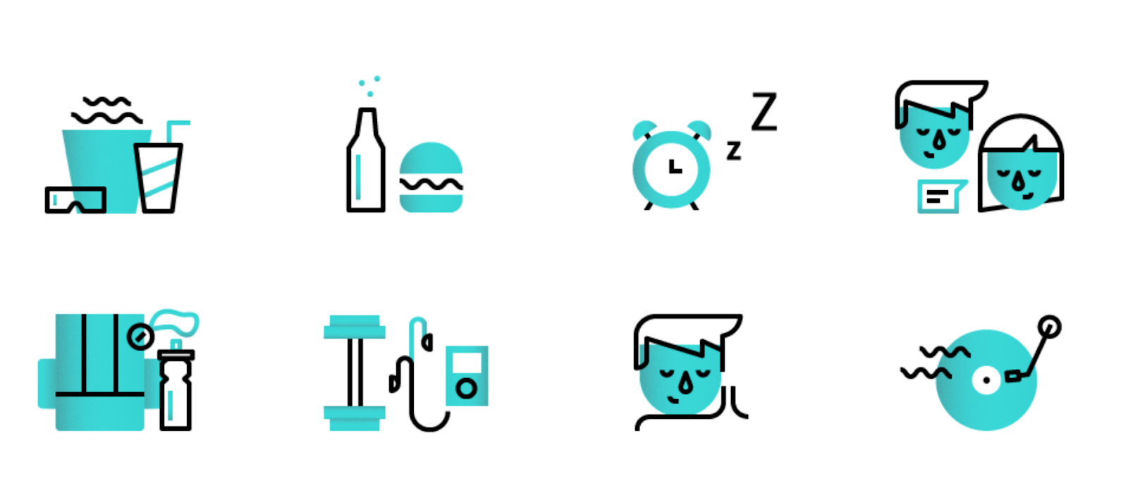
Mixed Depth
With mixed-depth icons, businesses can maintain a brand-wide color scheme that lends itself well to a unified, curated feel. The limited colors and simple lines tastefully convey an authoritative presence while serving user needs efficiently. Brands with a pared-down aesthetic should consider mixed-depth design in order to preserve a recognizable simplicity without sacrificing texture.
Single Line
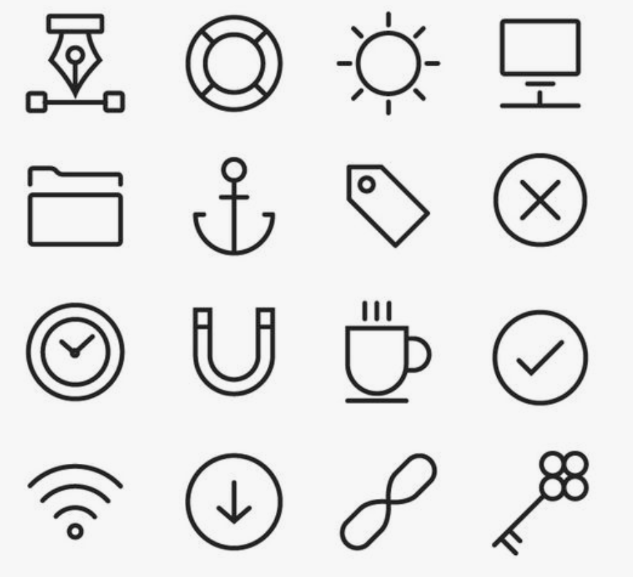
A single-line design makes for an elegant aesthetic statement, as long as brands use space wisely and prioritize usability. Stripped of ornamentation and over-coloring, single-lined icons work well for businesses looking to project a no-nonsense, minimalist aesthetic. These icons are bold in their sparseness, so brands that opt for this style should be sure that they’re ready for that level of visual austerity.
Two Tone

Two-tone icons represent a happy medium between single-line designs and their more colorful cousins. By holding onto a measure of simplicity while adding a bit of flare, these icons effectively balance user needs with branded aesthetics. Businesses that have established a recognizable color scheme across their digital content and marketing collateral should consider how two-tone icons might fit into their wider digital presence.
However your brand incorporates icon graphics into content, make sure that it’s consistent. By maintaining your aesthetic integrity, you’re providing users with a seamless experience that conscientiously balances intuitive navigation with visual appeal. Your aesthetic style will only become more recognizable as your business grows, so it’s important that you and your team design icons that serve your brand voice and make a positive first impression on consumers.