The font you use to introduce your products or services to the world should be a true reflection of your unique brand personality.
In today’s digital landscape, users have become highly adept at navigating crowded markets, evaluating brand aesthetics, and identifying the companies that most seamlessly align with their needs. Choosing the right type for your messaging, then, is an essential step in crafting your brand’s personality and cementing its credibility among your target consumer base.
With that said, typefaces that are chosen haphazardly can degrade the user experience, making it more difficult to convert consumers into fully fledged customers. Selecting the best font for your company means picking something that actively contributes to your goals, conveys your message, and is relatable to what you do — now and in the future.
The typeface you select will determine how your content is understood by your audience, meaning that it’s vital to make the right choice. By investing the proper time and resources into developing a typeface that serves your business well, you’ll be helping to build your brand’s voice while making a positive, lasting impression on your audience.
The Basics: Serif vs. Sans Serif and Hierarchy
We’re bombarded by typography every day — from street signs and billboards to the menu at your favorite restaurant — and based on those interactions, we develop subliminal expectations for any new typeface that we come across. Selecting a font is a science, and while you don’t need to be intimately acquainted with each and every existing typeface classification to make your decision, there are a few distinctions you should be aware of in order to effectively navigate the selection process.
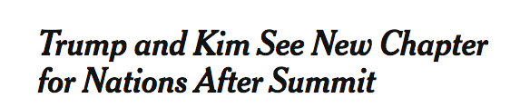
Serif typefaces include decorative details at the end of some strokes on a letter. They are typically easier to read and are commonly used in longer pieces of text — think body copy — but they also make an excellent choice for headers. The headers used in the Washington Post and New York Times, for example, are great instances of serif font lending a sense of tradition and quality.
Meanwhile, sans serif typefaces lack the serif extension at the end of a letter. They gained popularity in the 1920s thanks to their modern and industrial appeal, and the use of a sans serif typeface for body copy makes articles feel more readable. Take this example from the HuffPost:

When used properly, the use of both serif and sans serif fonts can help create an information hierarchy, one that will help draw the reader’s attention where you’d like it to go. By varying your font type as well as its size and weight, good type usage can create a sense of harmony that organizes your content, minimizes clutter, and preserves its aesthetic appeal.
Building Recognition
As Simon Garfield wrote in Just My Type: A Book About Fonts (an amazing read if you want to take a deeper dive into fonts and the history of typefaces), “Type has a rhythm, just like music.”
As such, it’s essential for your brand to maintain a consistent strategy when using fonts in order to build this sense of rhythm. Typography helps to distinguish your company and works as an easily identifiable symbol of your brand. The appropriate use of text font and size helps gain the trust of your customers and builds a strong sense of brand recognition.
These font choices should be situated within a larger design system in order to present a cohesive brand identity. Without a strong system of fonts, colors, and visuals, your content may appear disjointed or even jarring to the viewer, ultimately diminishing their experience of interacting with your brand.
When a Free Font Just Won’t Work
While most brands understand the importance of choosing the right type, too many shy away from actually purchasing the fonts that will best serve their business needs. Although paying for type might not make sense for everyone, it’s important to consider the long-term value of a strong typeface — especially if you’re building your company from the ground up. System fonts are reliable, but they come at the price of overexposure. The same is true for free fonts that may lack full glyph sets and offer limited weights, sizes, and styles to choose from.
Enlist your design team to help choose a font that that complements your brand. With their support, you can bring excellent legibility, consistency, and versatility to your content across key platforms. By giving your type the attention it needs, you will be creating an identity for your brand that will pay off for years to come.